hi! welcome to my blog
|
For this project, I was asked to create a logo with three different designs. The tools I used in Gravit were the shape tool - for a rectangle and a line, the Pen tool - to make a certain shape I wanted and to write out some words. First, I used the Pen tool by curving the lines to make the "tree crown." Next, I made the brand name with the Pen tool and the Line tool. Then, I used the Shape tool by making a rectangle to make the "tree stem." Lastly, I organized everything in the shape of a tree. The most challenging thing about the process was when I was creating the brand name, with the Pen and the Line tool. There were a lot of obstacles but I kept on working on it diligently until I finally got it the way I wanted. 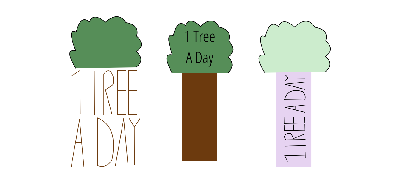 The name of my brand is "1 Tree A Day." I decided to create this logo because the main focus of my brand is to plant trees, specifically 1 per day, to help improve the environment of the Earth. The logo represents the brand because all three of the logos have trees within them. This logo is my favorite because I think it's different from the other logos. The other two have words on the tree, while this logo has words that are apart of the tree. 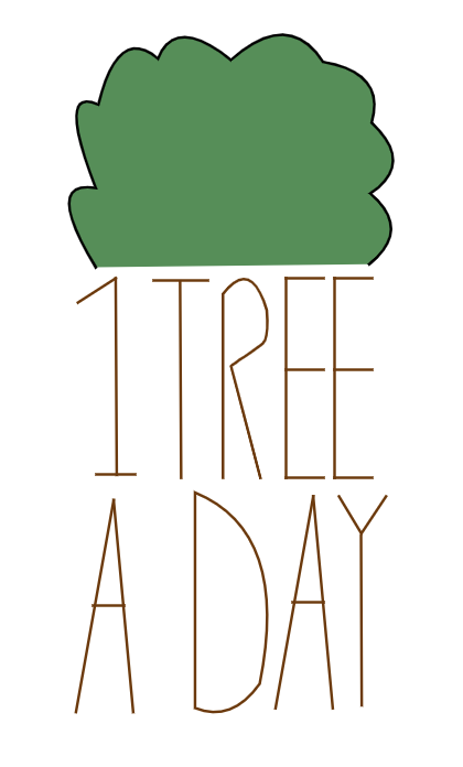
1 Comment
For this project, I was asked to make two color-themed designs. The first one, Color Names, asked me to create a piece of artwork that displayed at least 15 different colors. I had to label each color with its HEX code and RGB value. The second one, Color Schemes, asked me to create four different color palettes (Monochromatic, Analogous, Complementary, and Triadic) with 5 colors in each palette. I also had to label each color with its hexadecimal code. I used the Text tools and the shape tools - specifically a square, while using Gravit. I also used a website called Adobe Color while working on this project. The website helped me choose colors using the color palettes on the side of the page. For example, if I wanted to make a Complementary color palette, I could just click on "Complementary" and drag the circle around the color wheel until I find the colors I'm looking for. COlor Names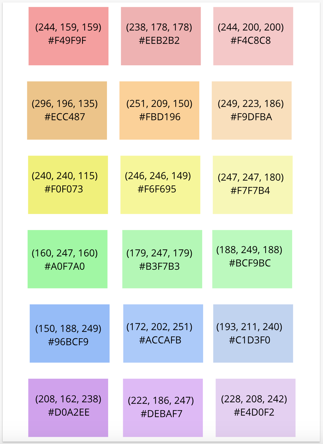 Color Schemes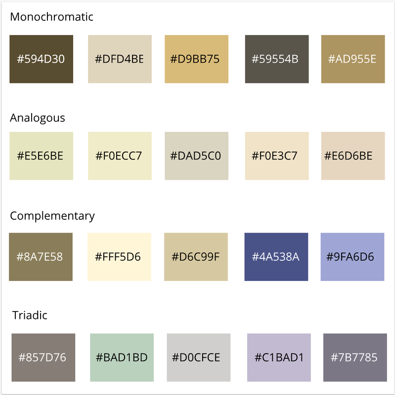 Typography is how something appears and looks like, it's mostly what the written word looks like. Typography is important because today people often look at something and judge it right away just by how it looks, so it's important for people to create things that are appealing to look at. The quote "Each font has a personality and a purpose," means that not every font can be used for the same thing. Every font has a different thing they're used for. The five fonts we learned in class are Serif, Sans Serif, Monospaced, Script or Handwriting, and Display. Serif fonts have "feet" and are usually used in large blocks of text and print. Sans Serif fonts don't have "feet" and are used for headlines, titles, smaller blocks of text, and the web. Monospaced fonts are used in coding, doesn't work well with large blocks of text, and each letter has the same amount of space. Script fonts include cursive, calligraphy, and handwriting and are good for logos, big headlines, and details. They can also be hard to read. Display fonts are used to get attention from someone, used in small quantities, and its popularity can come and go. Typeface ComparisonFor this activity, I wrote one phrase using many different fonts. 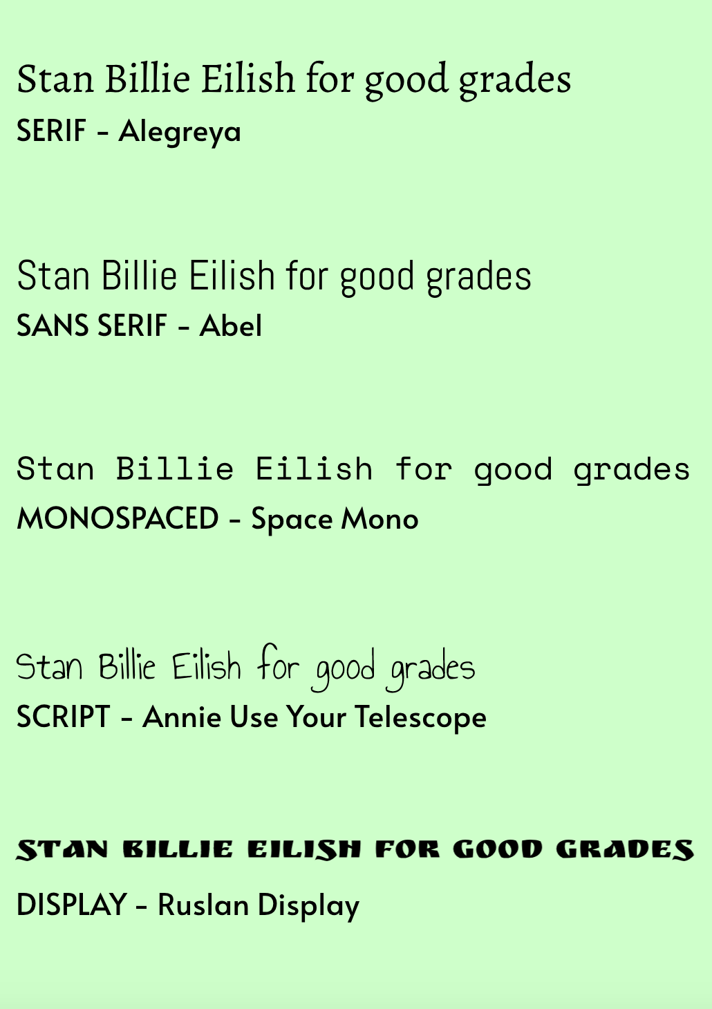 Word PortraitsFor this activity, I wrote one word that goes with the chosen font and one that doesn't. 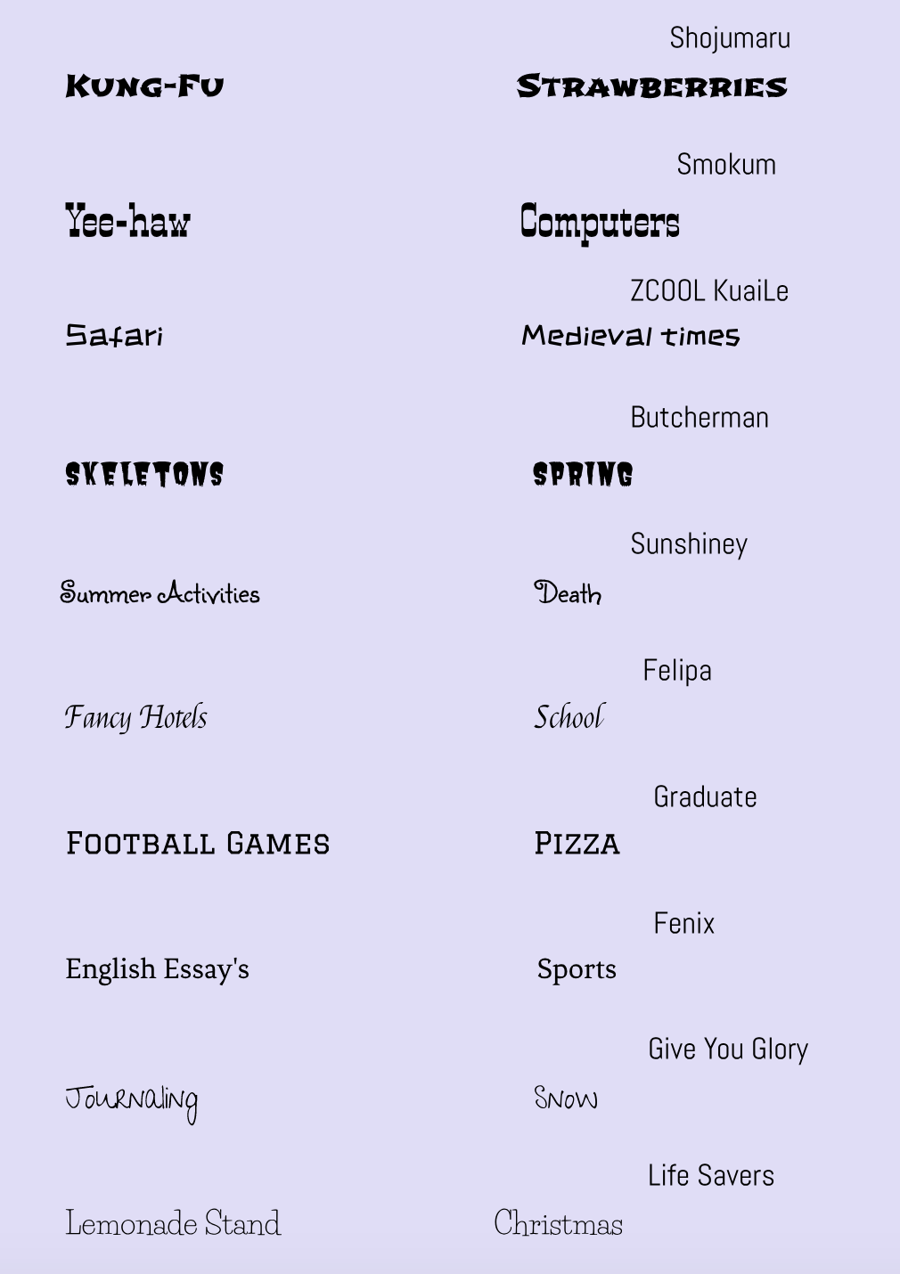 In these three exercises, I was assigned to use the Pen Tool in various forms. The first exercise taught me the basics of using the Pen Tool, the second exercise taught me how to trace complex illustrations, and the third exercise taught me how to create a composite image using different tools. The Pen Tool is a tool that allows me to create lines/paths and shapes. It also allows me to make complex images. In my final image, I created something representing people climbing Lotte Tower (Person 1, Person 2, Person 3, Person 4, Lotte). I faced many challenges including, tracing the Spider-Man icon, cutting out the penny, and making paths for each image in the final exercise. To overcome these challenges, I re-did things over and over again, and asked for help if a certain thing was just too hard for me to do. 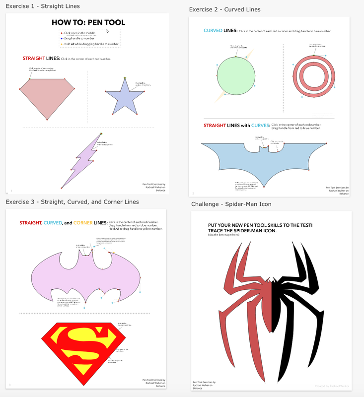 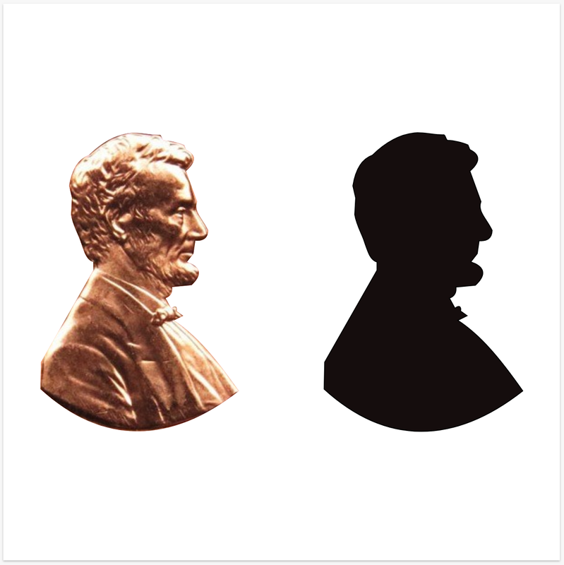 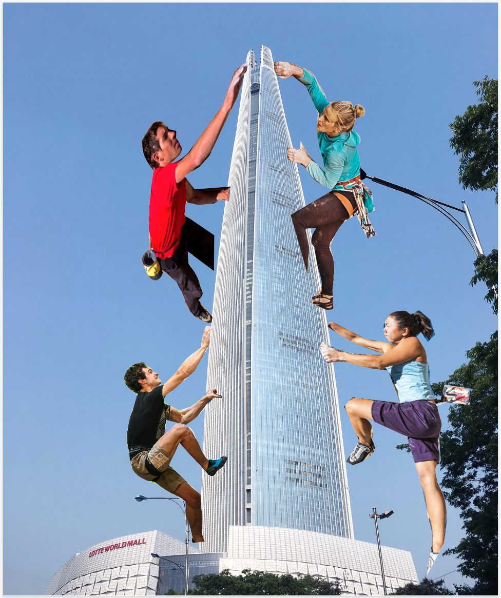 For this project, I made a graphic representation of my bedroom. This is meaningful to me because I like being in my bedroom and I feel like it's my safe space ✨. 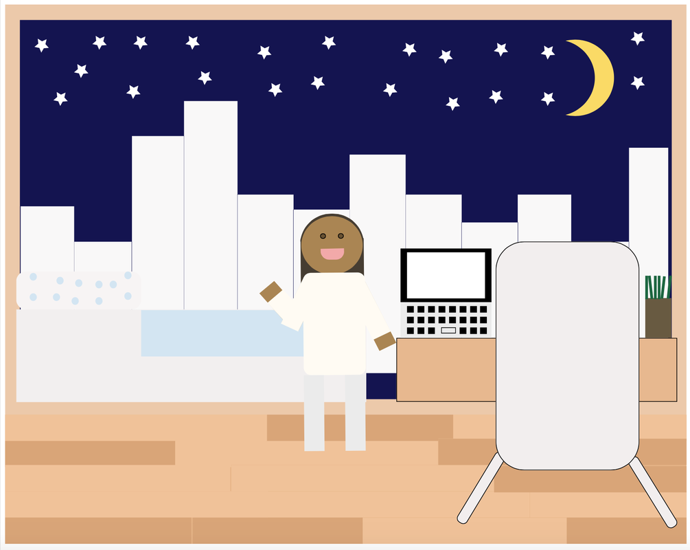 I learned how to edit shapes in different ways to create other shapes. I also learned how to modify shapes in different ways. 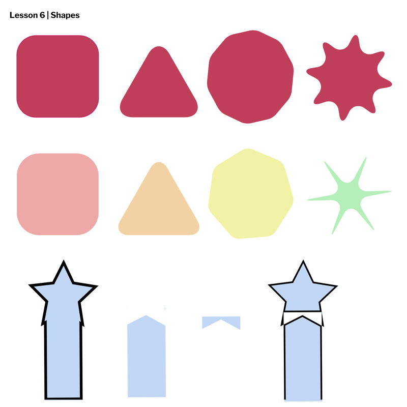 I learned how to organize different layers, as well as group shapes together. I also learned how to align multiple shapes together. 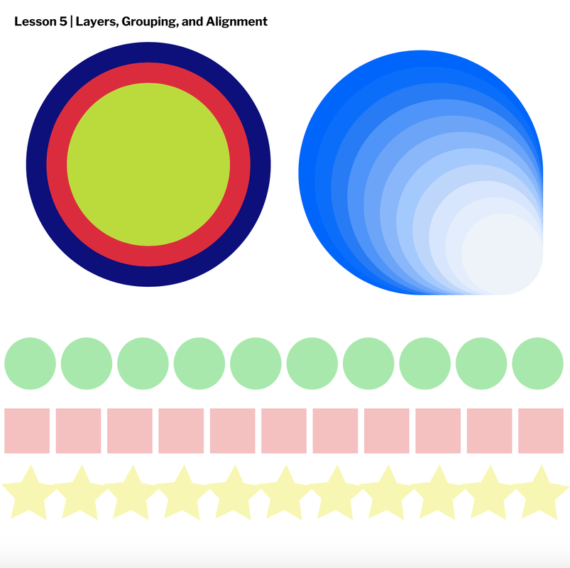 In this lesson, I learned how to use different tools to create many different borders. I also learned how to work with dashed lines and shapes, and also make shapes transparent. 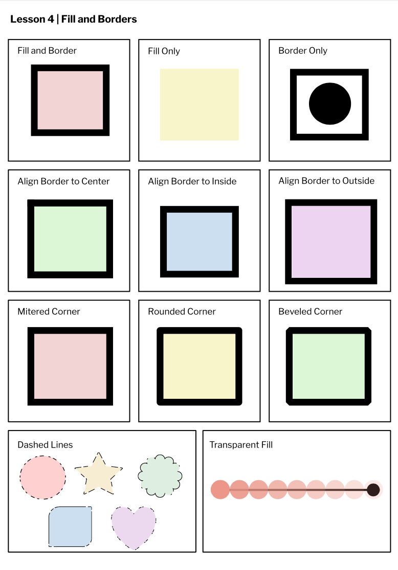 I learned how to edit shape sizes, change colors of shapes, use the different shortcuts in Gravit, modify shapes, and etc. 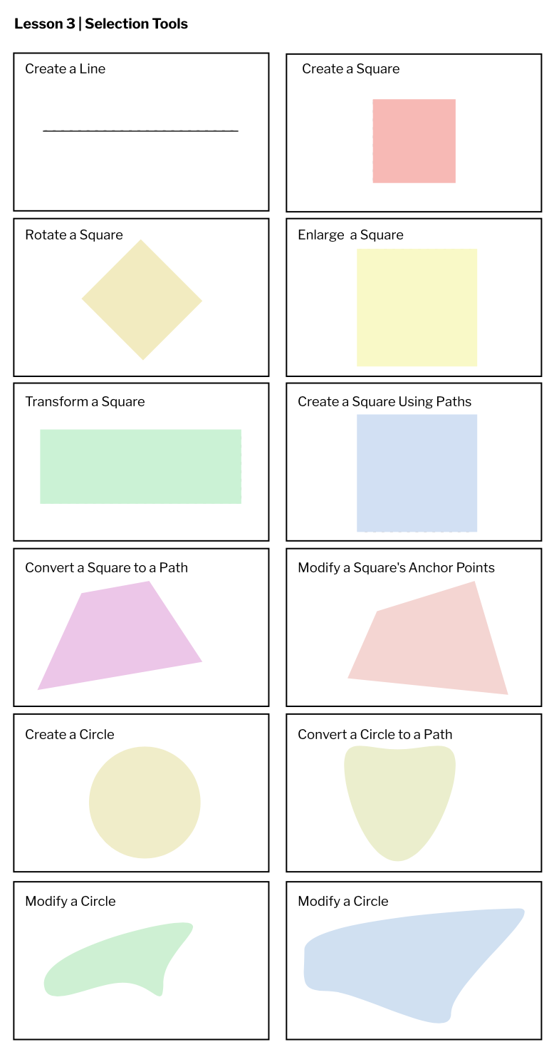 I learned how to use Gravit and use the tools to create different things, including a text box, multiple pages, changing units, changing colors, etc. 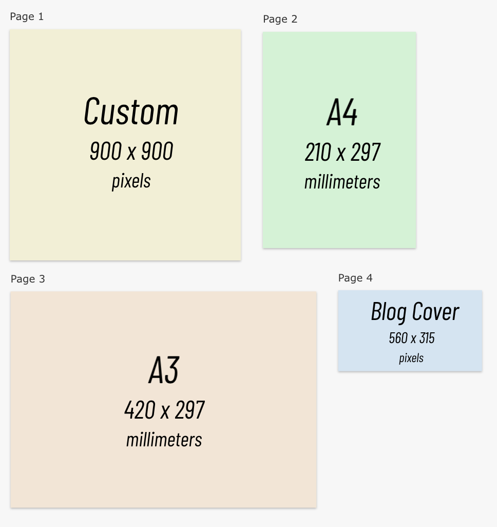 |
AuthorHi! I'm Baiza. This is just a 7th grade technology project. And I hope you enjoy reading my blog :) Archives
May 2021
Categories
All
 This work is licensed under a Creative Commons Attribution-NonCommercial-NoDerivatives 4.0 International License. |
